How to create your own new chart type in Protobi
June 16, 2025
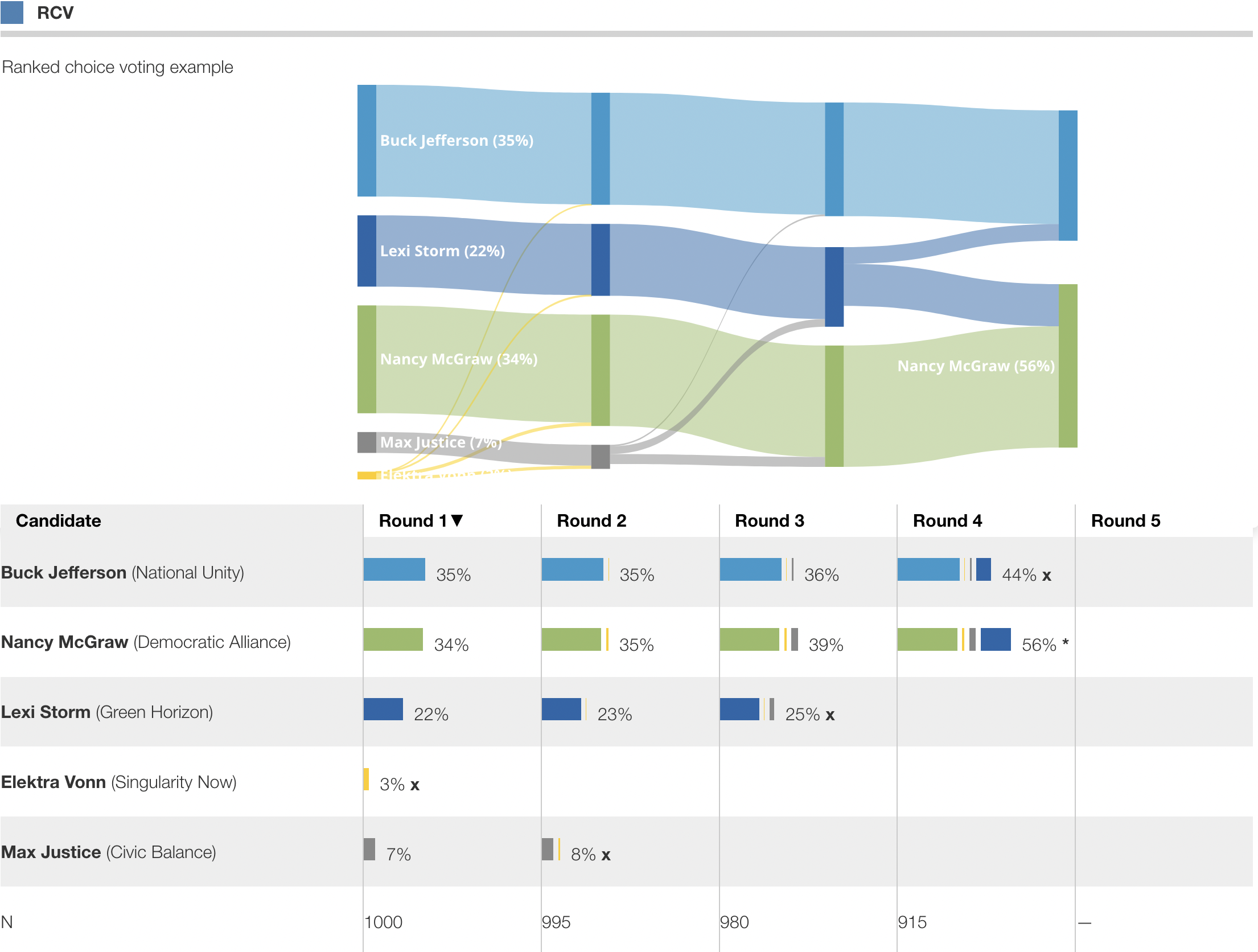
This article describes how to create your own new chart type in Protobi. Here we create a widget that applies the ranked choice voting algorithm to rankings in a survey, and visualizes the result as a bar chart and a flow chart described in this post, Ranked Choice Voting in Protobi .
Start with a sketch
Start by drawing out your visualization with markers on a white board or notebook:
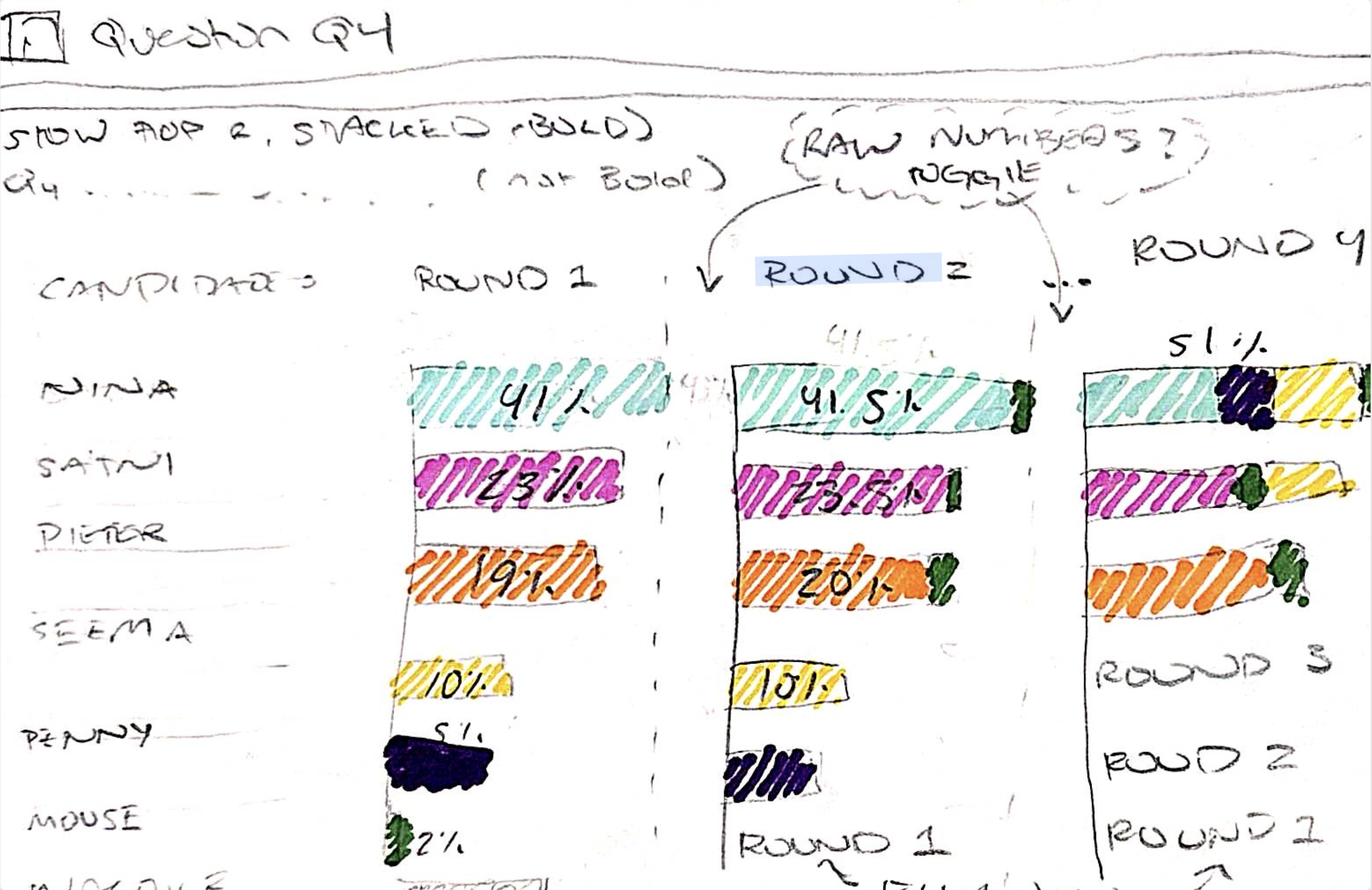
And visualize in your own mind how you'd like it work and interact with your clients:
Create a new element
Create a new element by pressing the [+] button in any tab, and choose a unique identifier:
This will create a new blank element:
Mock up static HTML
Bring up the content editor by selecting the element and typing X C key board shortcut (shift+X followed by shift+C) in sequence.
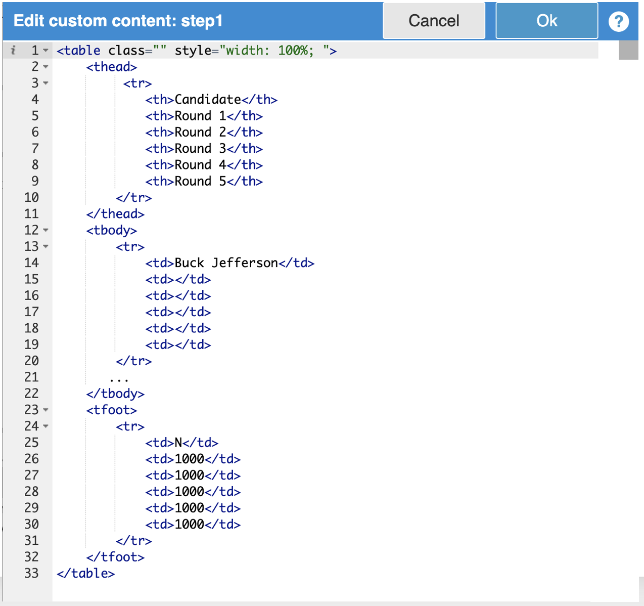
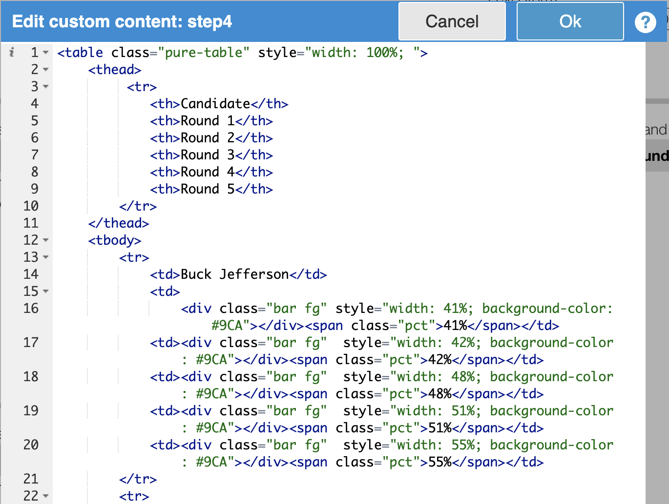
Start by creating very basic HTML with unstyled div and table elements:
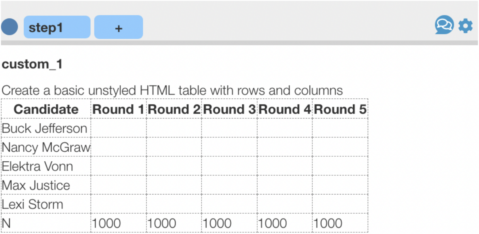
Later steps will automatically generate most of this code but for now it could like below:
Add div elements to represent bars, icons, etc.:
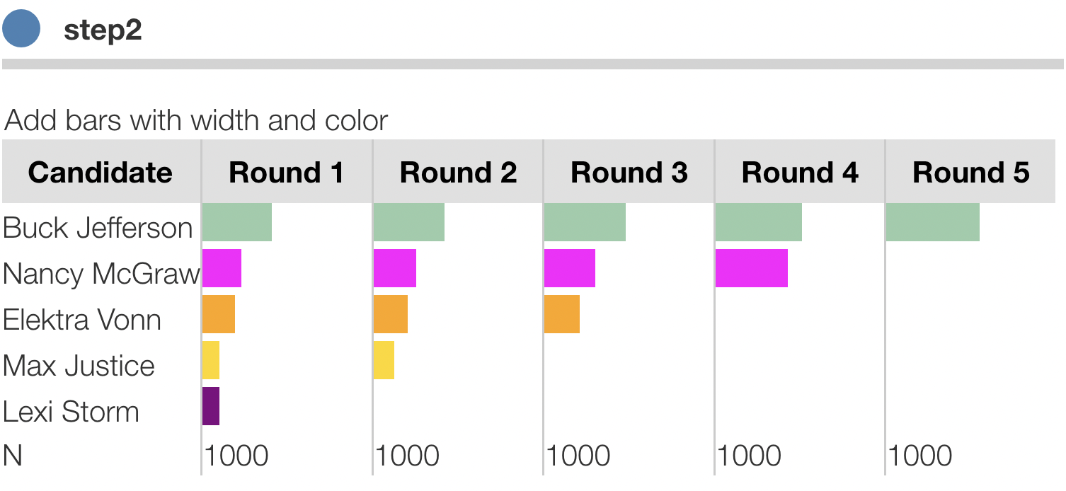
Add div elements for data values, statistics, axis titles, etc.:
The code below shows a <div> for the bar and a <span> for the number.
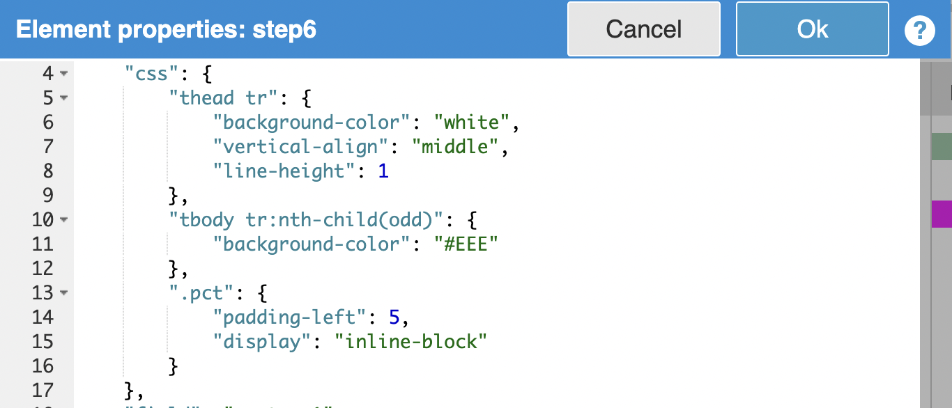
Style with CSS
Apply CSS classes for concepts, such as "title", "bar", "qty" and add these classes to the HTML:
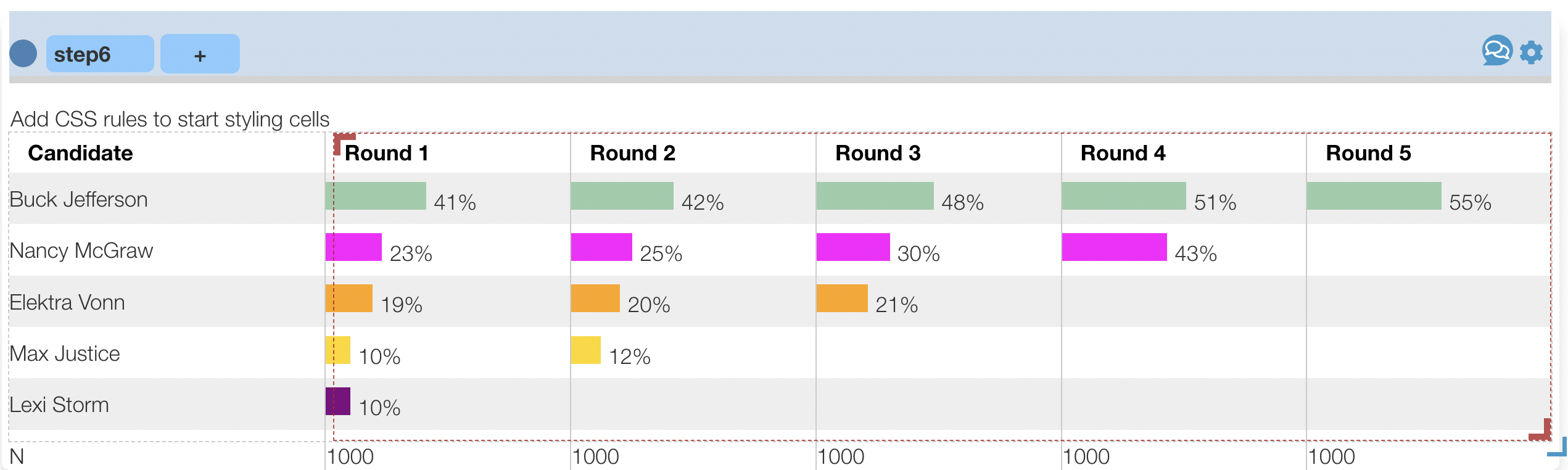
Here we are re-using CSS classes used elsewhere in Protobi such as class="bar fg" for the bars and class="qty" for the numbers. This isn't necessary, it just helps make it easier to style new elements similar to other Protobi charts.
For new rules specific to your chart, initially, you can experiment with CSS by adding to the JSON for this element. Later you can add style rules to *Custom CSS *under Project settings... for this project (and later for your organization's master template project).
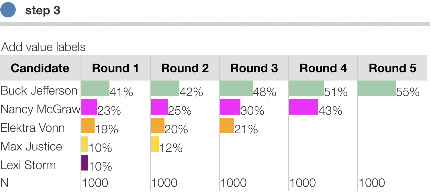
Refine details
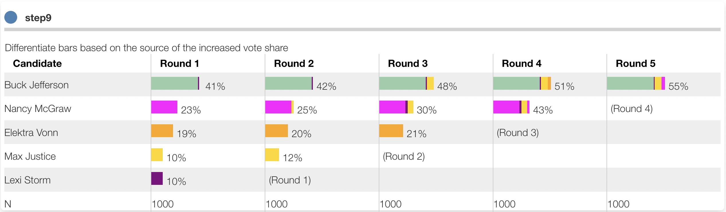
Here we differentiate the bar charts based on the source of share from each candidate at each round. Again, these are just static div elements that we will soon automate.
Generate HTML from a data structure
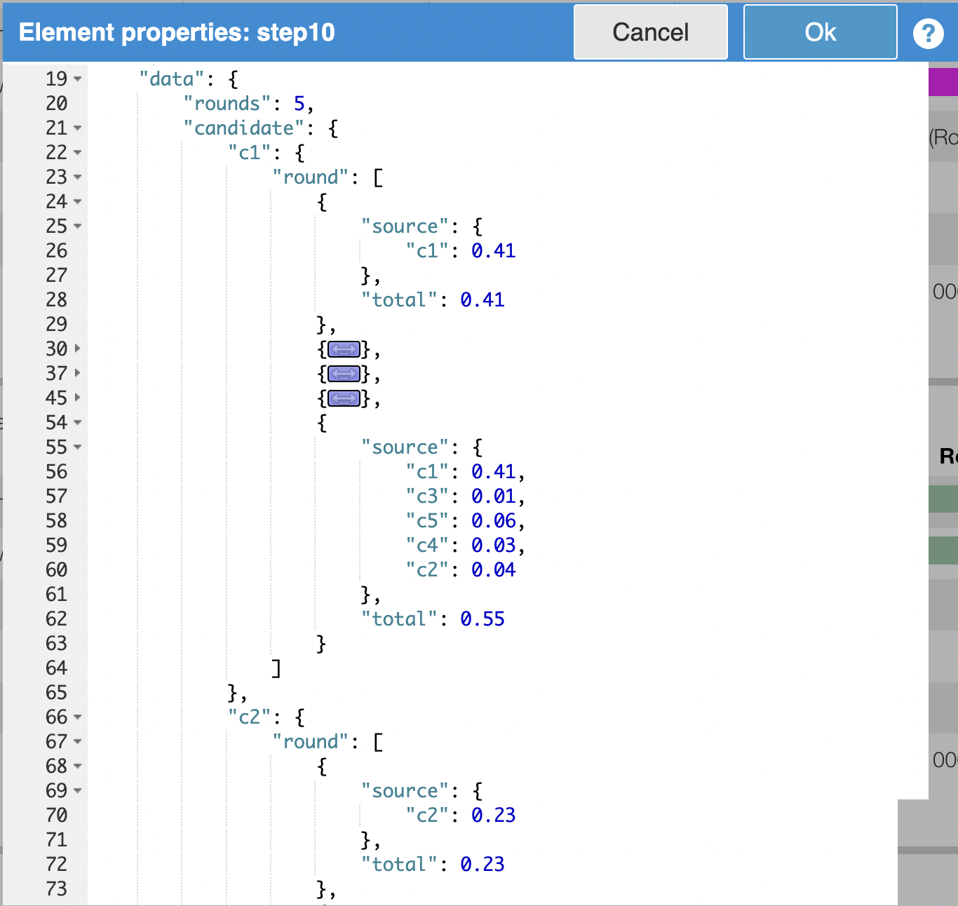
The cool part is generating the HTML structure from data. We'll first start by defining a data structure that contains the information needed to create the chart in some convenient format. This may take a little iteration.
Here we define an object data that lists for each candidate, for each round, the total share of votes at each round and the share inherited from each other candidate in that round. For convenience we save this in the element's JSON data:
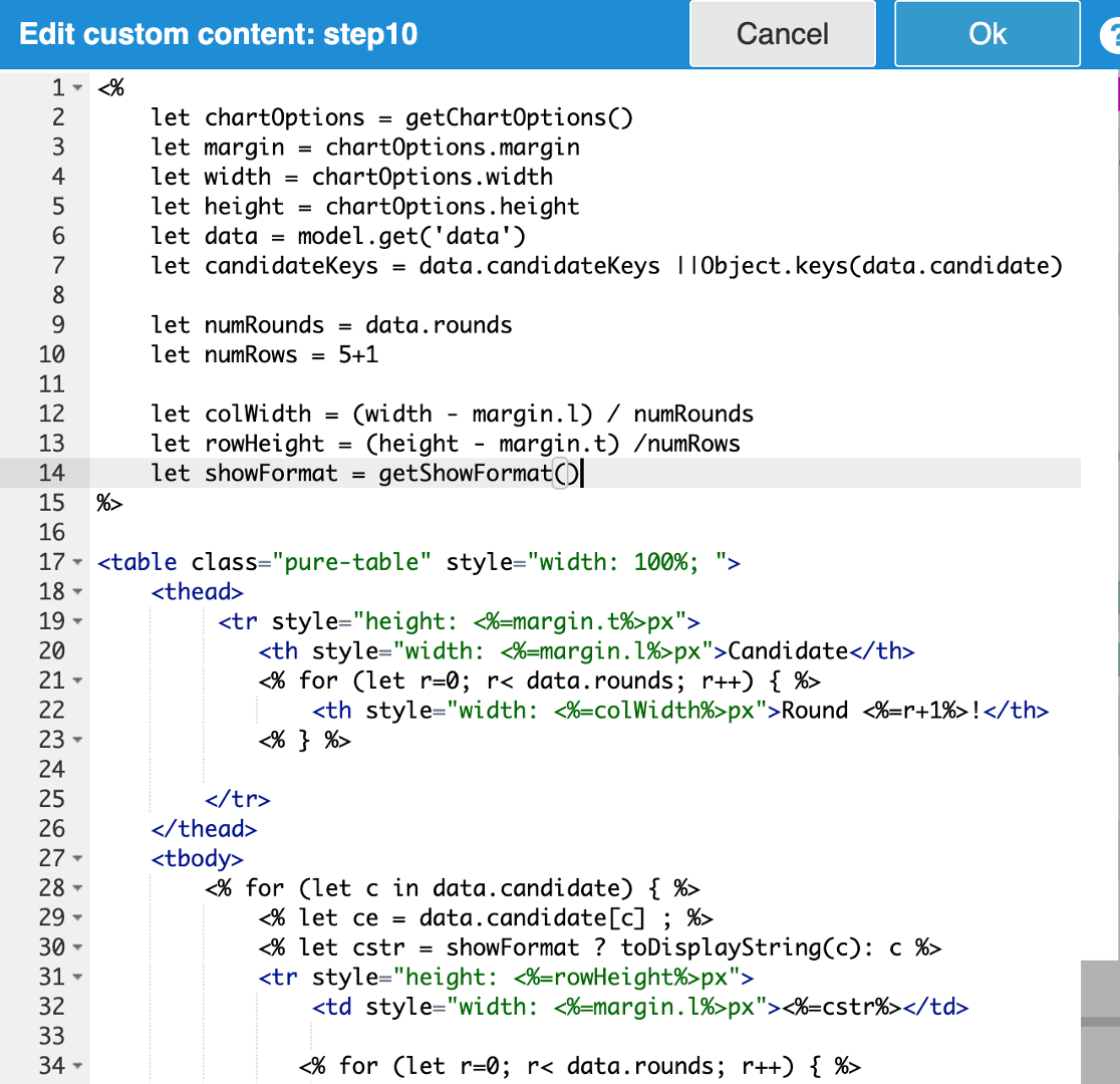
We then modify the code to change the static HTML above into a dyanamic template with embedded Javascript code that generates the HTML from data. Protobi uses a widely used syntax called "EJS". See the tutorial Embedded Javascript Templates in Protobi for more.
The key point here is that code inside angle brackets e.g. <% let data = model.get('data') %> is executable code that can be used to get data, define variables, and loop over values.
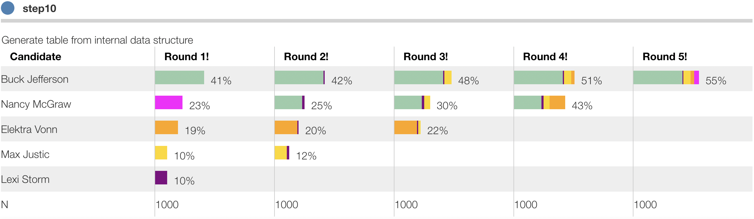
The result here looks like the earlier chart but is now entirely created from the internal data structure:
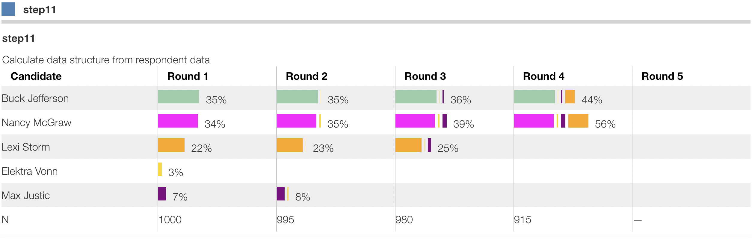
Calculate the data structure from data
The next step is to extend the embedded JS code further to calculate that internal data structure from respondent data and other element parameters. This is more involved because the RCV example is itself a little tricky. But all it does is create a data structure like the one we postulated above, just from survey data.
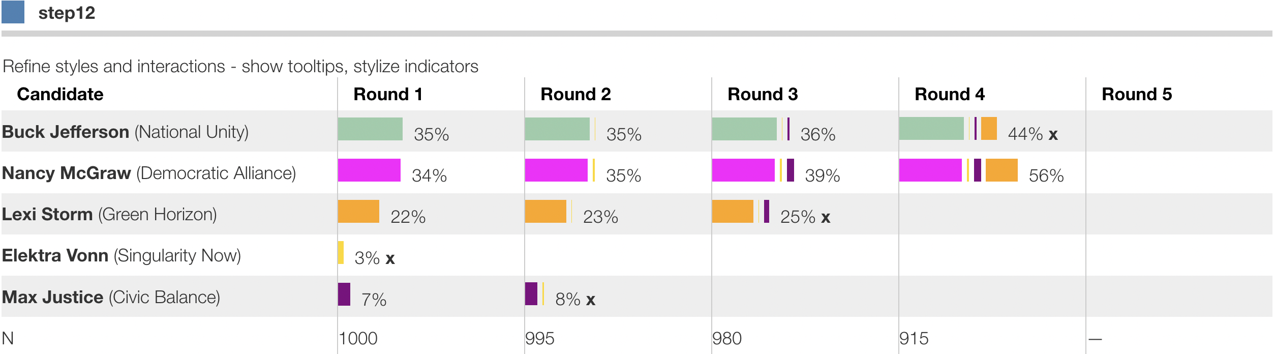
Refine styles and interactions
From here the next step is to refine the styles and interactions, such as:
- Clicking on column header should sort the data by that column.
- Hovering over a bar should show details on the source of votes from the eliminated candidate.
- Pressing on a row title should drill into respondents who voted for that candidate in any round.
- Pressing on a bar should drill into respondents who voted for that candidate in that round.
- etc.
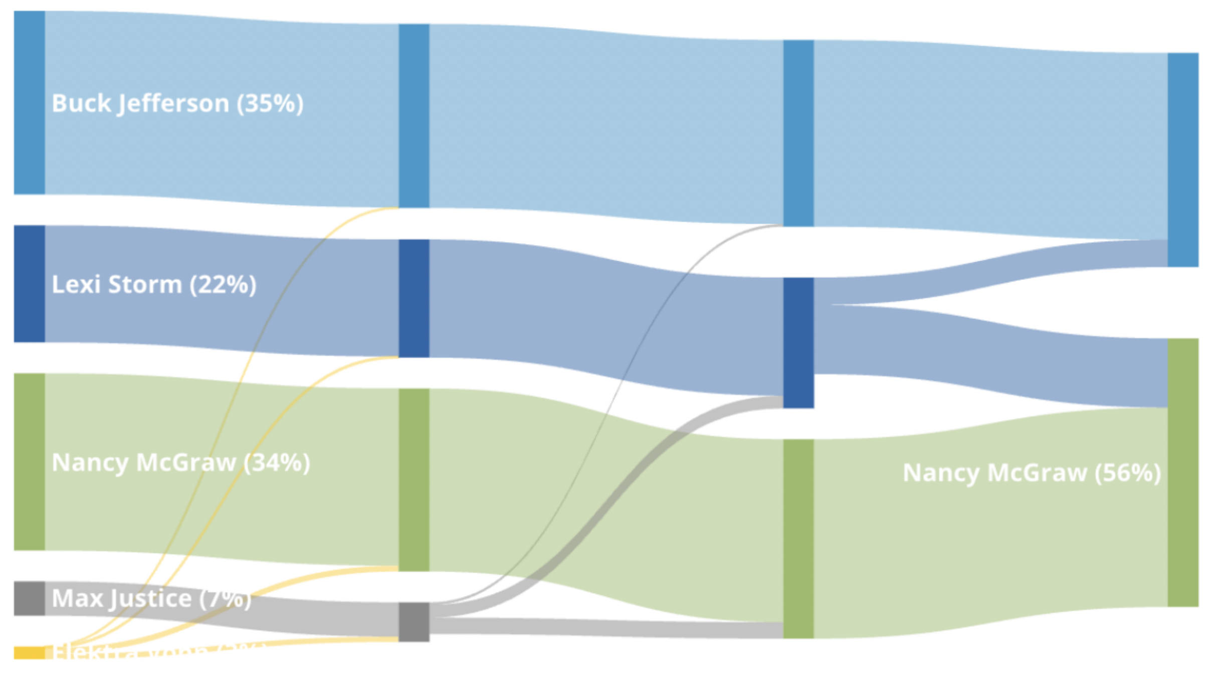
Try additional optional visualizations
It's also possible to create visualizations using external libraries. Here we extend the code to also generate a data structure that specifies a Sankey flow chart diagrm in Plotly.js
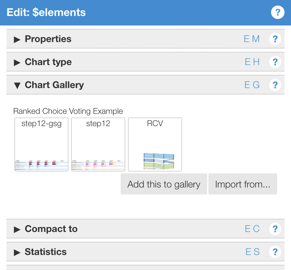
Save to chart type gallery
Now that the chart is created once, save it to the chart gallery so that it can be reused within this project and across other projects in your firm:
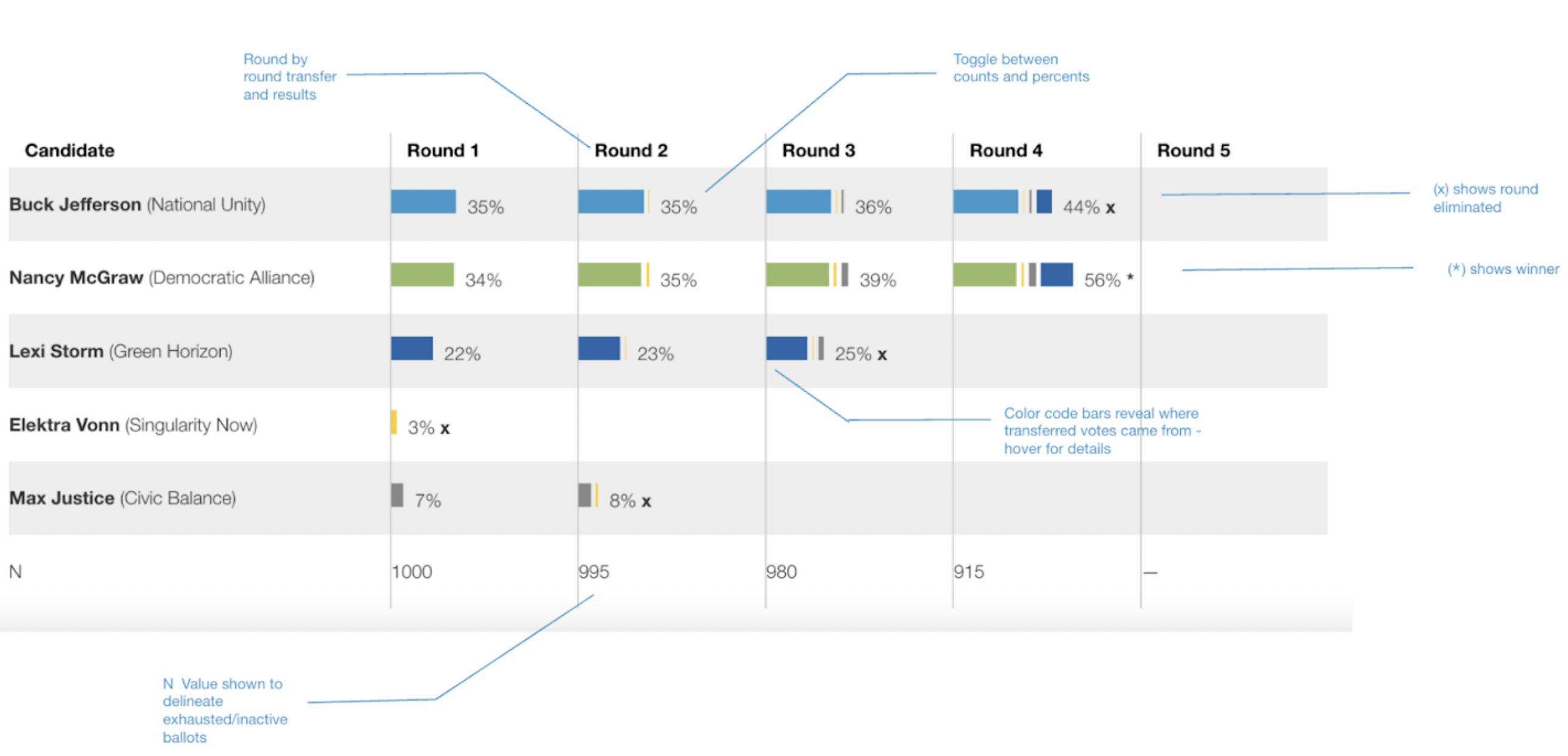
Final result
The final result is below